Jewelry by Tina Khmelnitskaya (Тина Хмельницкая)
Identity, Advertising products
Concept & Design Thinking
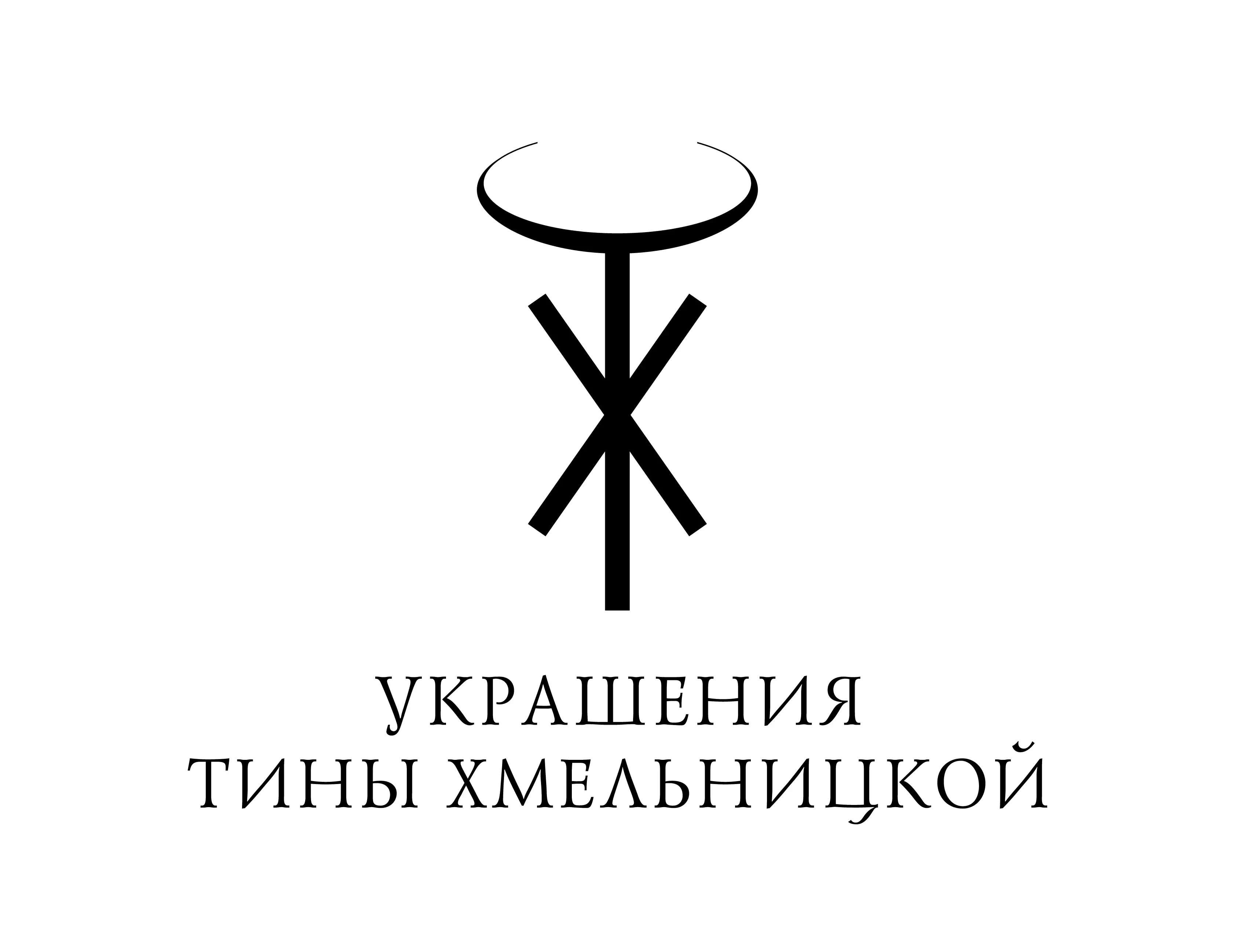
The identity for jewellery designer Tina Khmelnitskaya elegantly embodies the fusion of her initials "T" and "X" (Cyrillic "Т" and "Х" — Тина Хмельницкая) into a minimalist, symbolic monogram reminiscent of a sophisticated necklace. The design uses simplicity and sophistication to evoke luxury and timelessness, core values of Tina's jewellery.
The monogram not only incorporates the designer's initials, but also subtly evokes the shape of a precious jewel, creating a visual continuity between the designer's identity and her creations. The delicate upper arch symbolises a necklace or an abstract halo, emphasising elegance, purity and exclusivity.
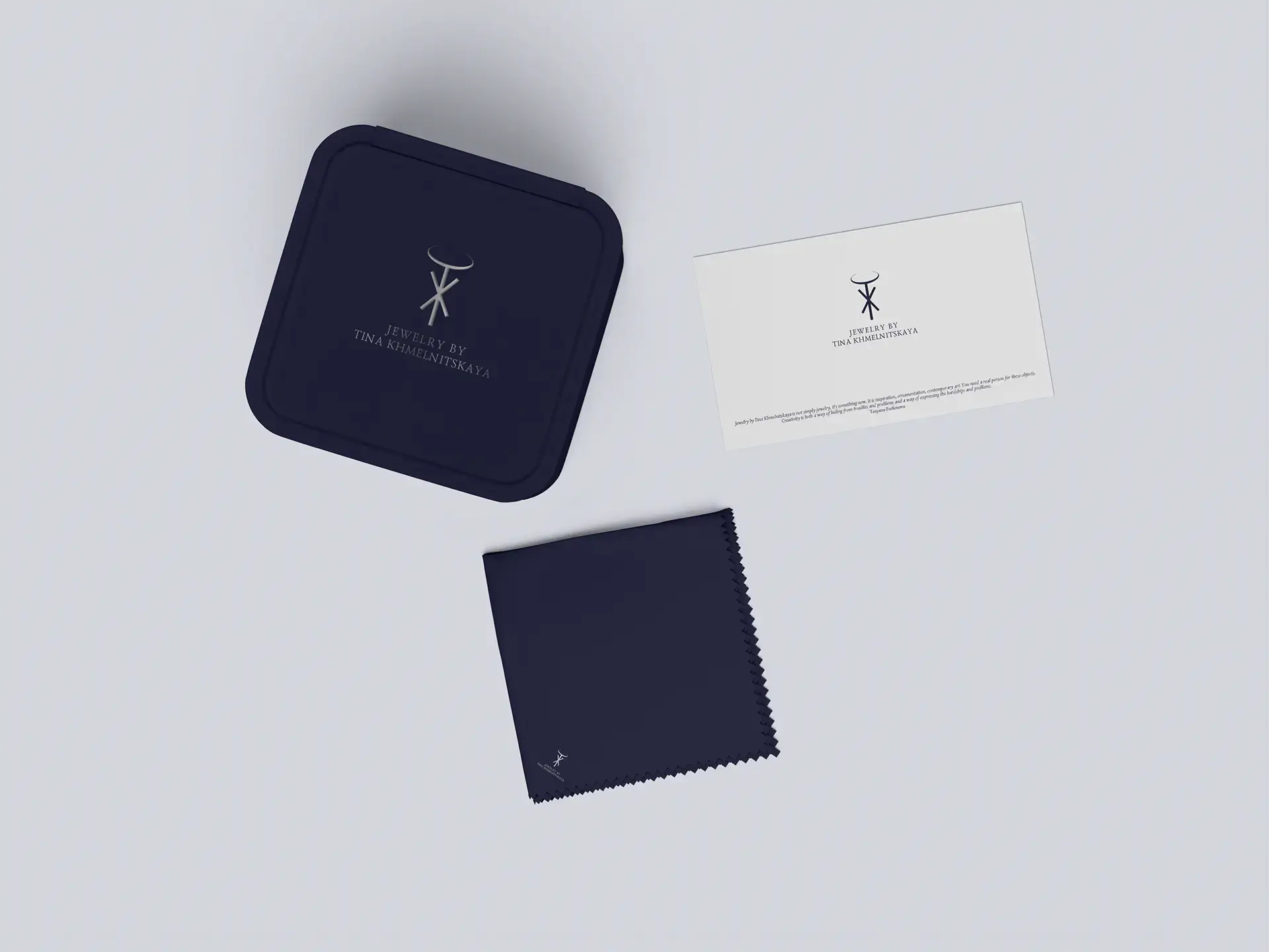
Implemented in versatile black and white colour schemes, the identity adapts effortlessly to different media, from premium jewellery packaging and business cards to high-impact in-store posters. This visual language ensures that the brand's essence — elegant craftsmanship and understated beauty — is communicated clearly and consistently across all touch points.
The careful balance of minimalism and symbolism positions Tina Khmelnitskaya's brand uniquely, reflecting both her meticulous attention to detail and her conceptual approach to jewellery design.


