Restaurant Publica, SPb
Conception, Interior, Brand Identity
Concept & Design Thinking
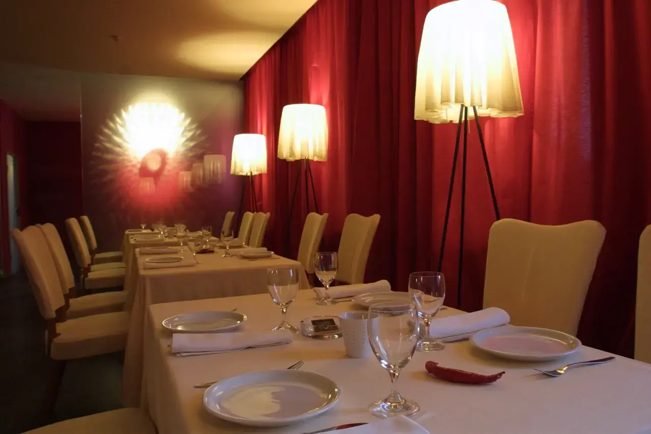
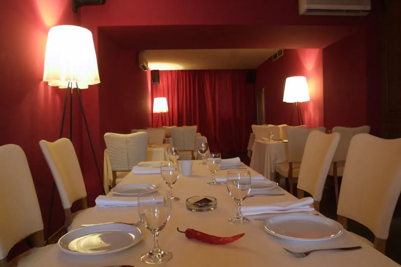
The core idea behind the "Publika" restaurant explores the intersection of sensory stimulation, emotional intimacy and refined aesthetics. The concept focuses on creating a dining environment that transcends mere functionality and becomes a catalyst for emotional engagement.
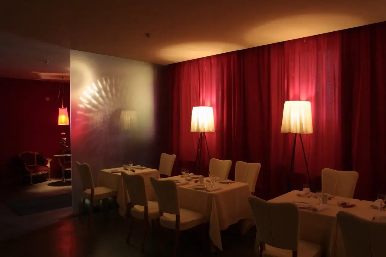
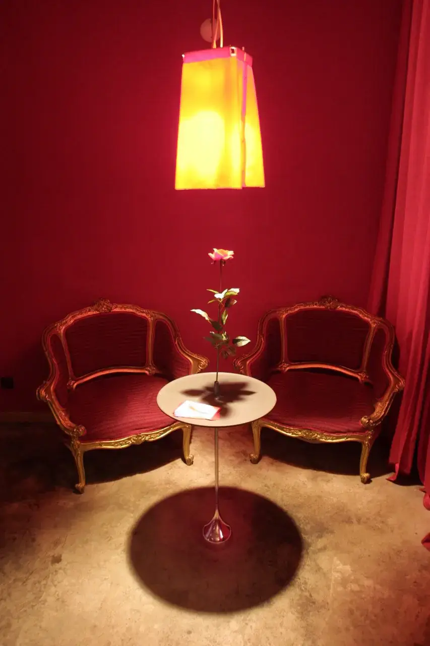
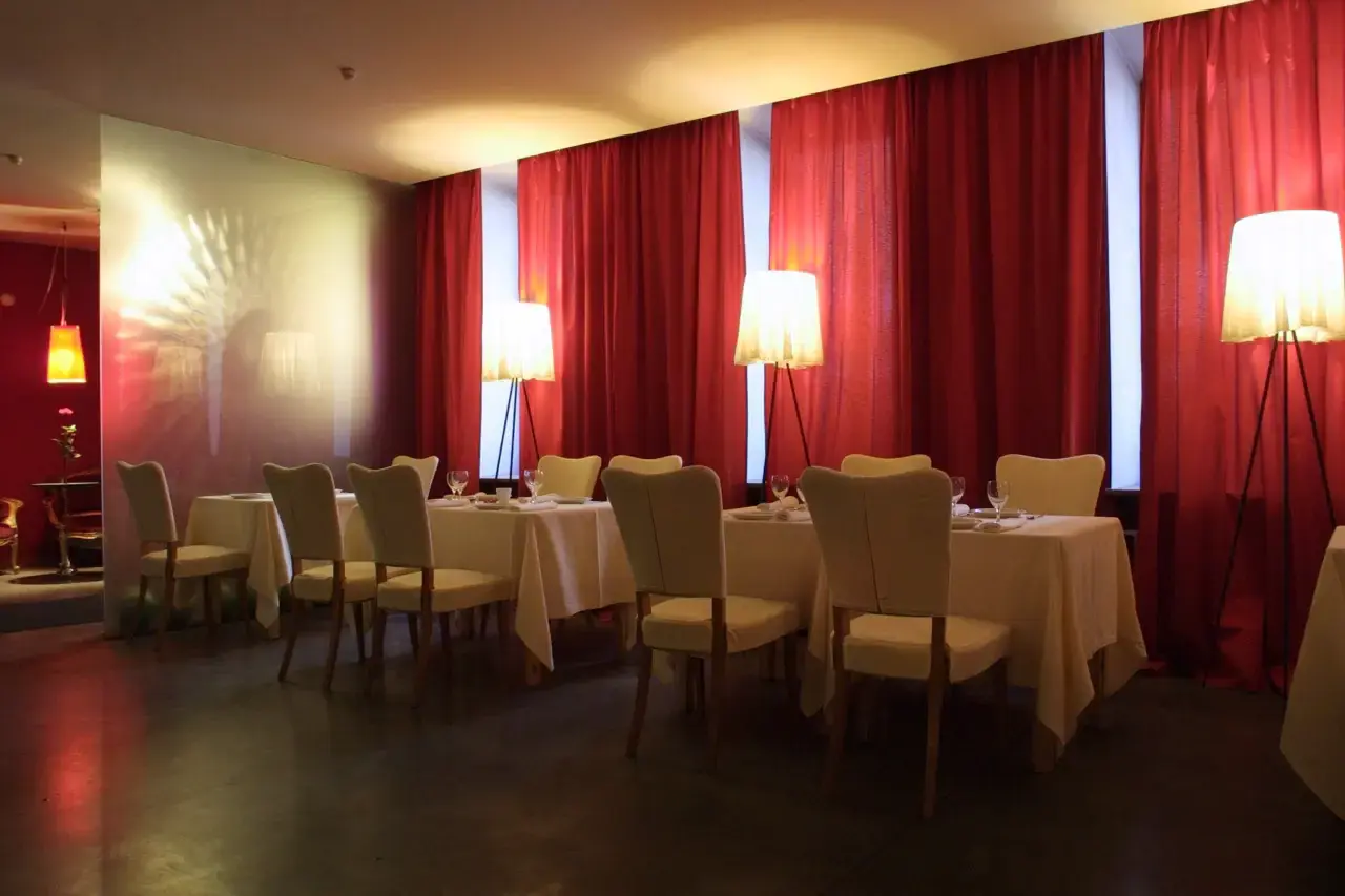
The project begins with the idea of contrasts — combining sensory opposites such as heat and sweetness (symbolised by the chilli pepper and sugar imagery), privacy and openness, passion and serenity. The interior space plan exploits the interplay of subtle lighting, rich textures and strategic colour blocking. Red is deliberately chosen for its ability to evoke emotions of passion, warmth and sophistication, carefully balanced with neutral tones to avoid visual overload.
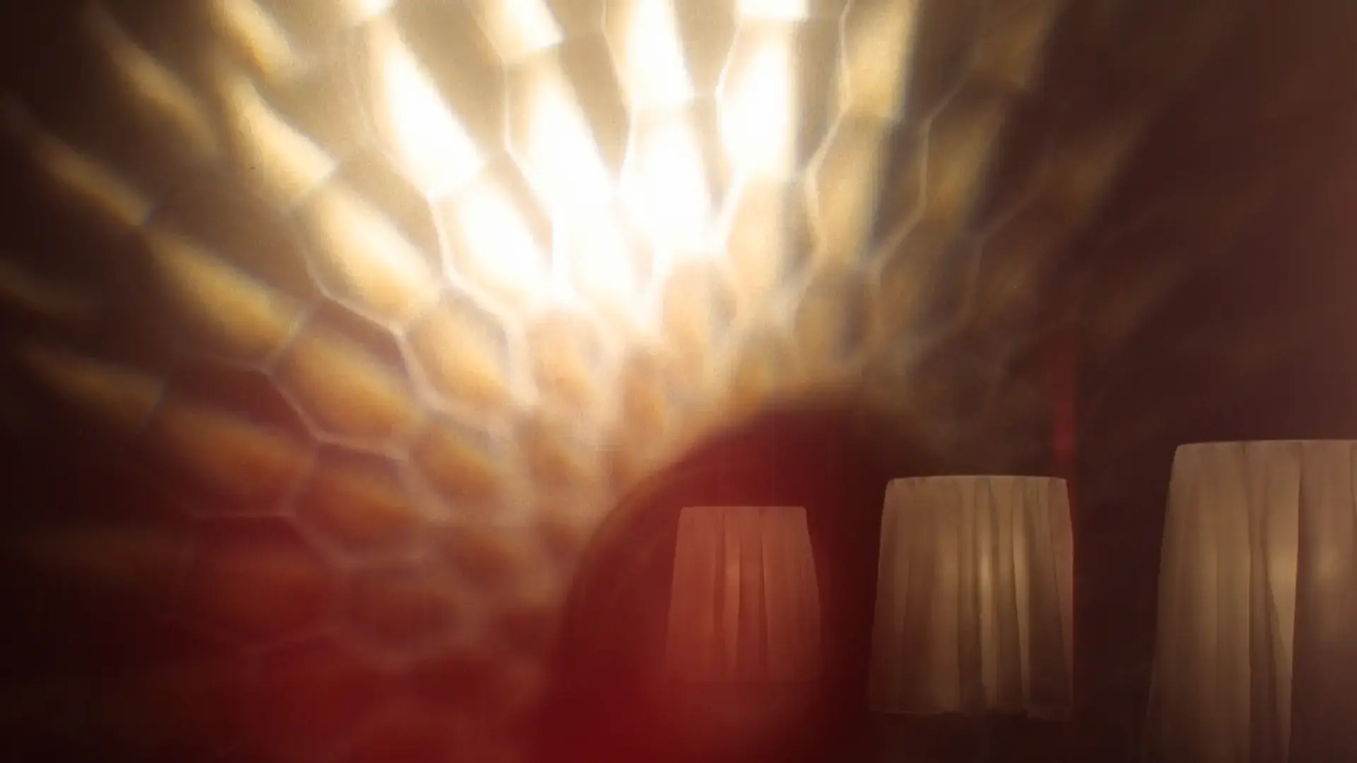
Lighting becomes a critical narrative device — patterned refractions through textured surfaces create dynamic, abstract visuals that reinforce the restaurant's identity and enhance the emotional intimacy of the space.
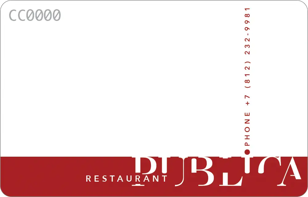
The corporate identity reflects this spatial philosophy, integrating minimalist typography, asymmetric arrangements and a sophisticated use of negative space. The visual language is consistent across all brand touchpoints, from business cards to club cards, ensuring the customer journey is seamless and memorable.
Through deliberate contrasts, evocative visual cues and cohesive branding, Publika restaurant embodies a thoughtfully curated narrative of sophisticated intimacy.
