Musical Instruments Shop "Mi"
Logotype, Brand
Concept & Design Thinking
"Mi" (E), "Mira gestorum", the third note of the scale in solfege.
The logo and identity for Mi Musical Instrument Store was inspired by the third note of the solfege scale, "Mi" (E), which represents clarity, precision and musical elegance. The graphic mark cleverly uses the visual metaphor of piano keys in combination with the stylised letters "Mi" and the notation of a musical note. The minimalist geometry creates an easily recognisable, rhythmically balanced identity that reflects both musicality and modern sophistication.
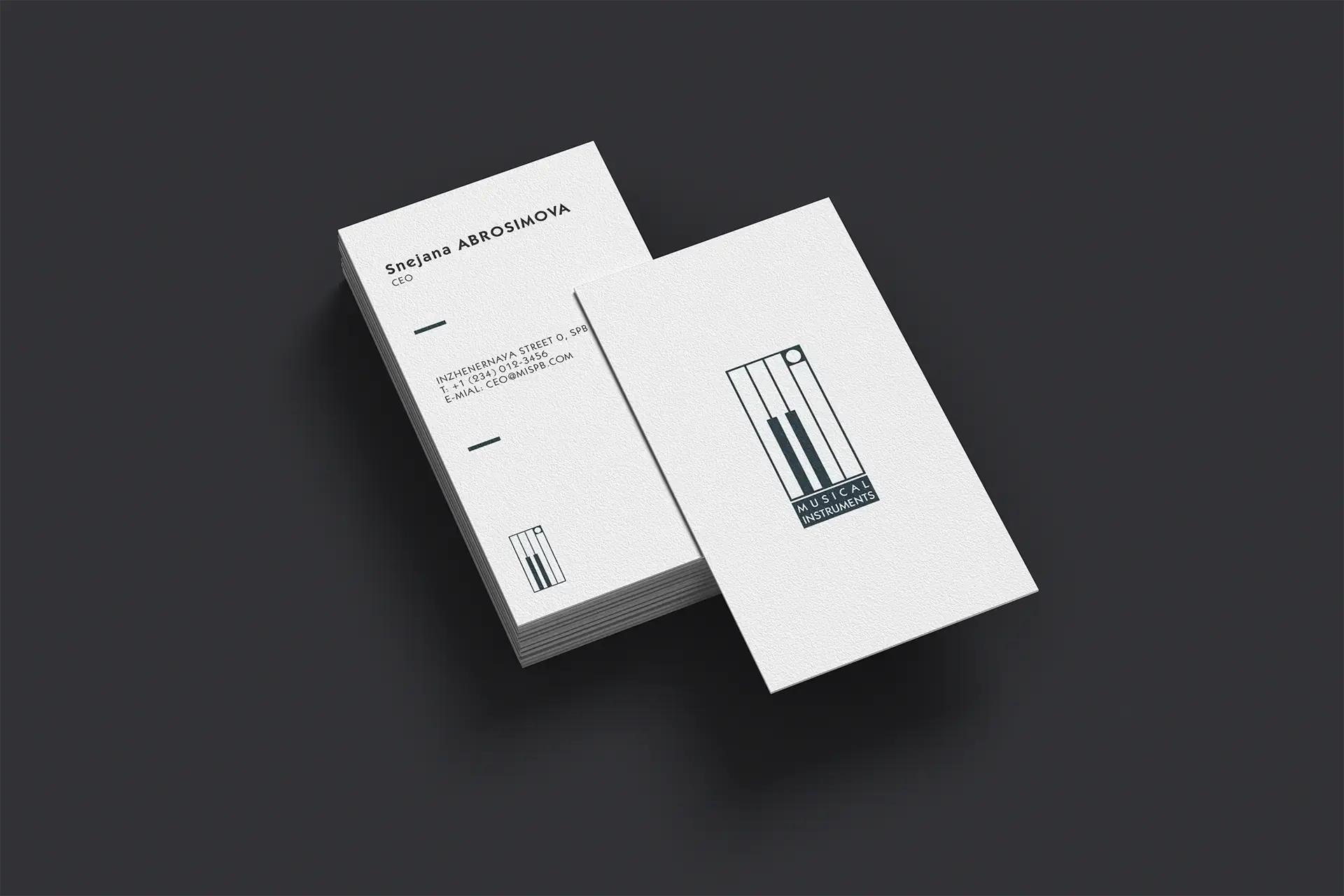
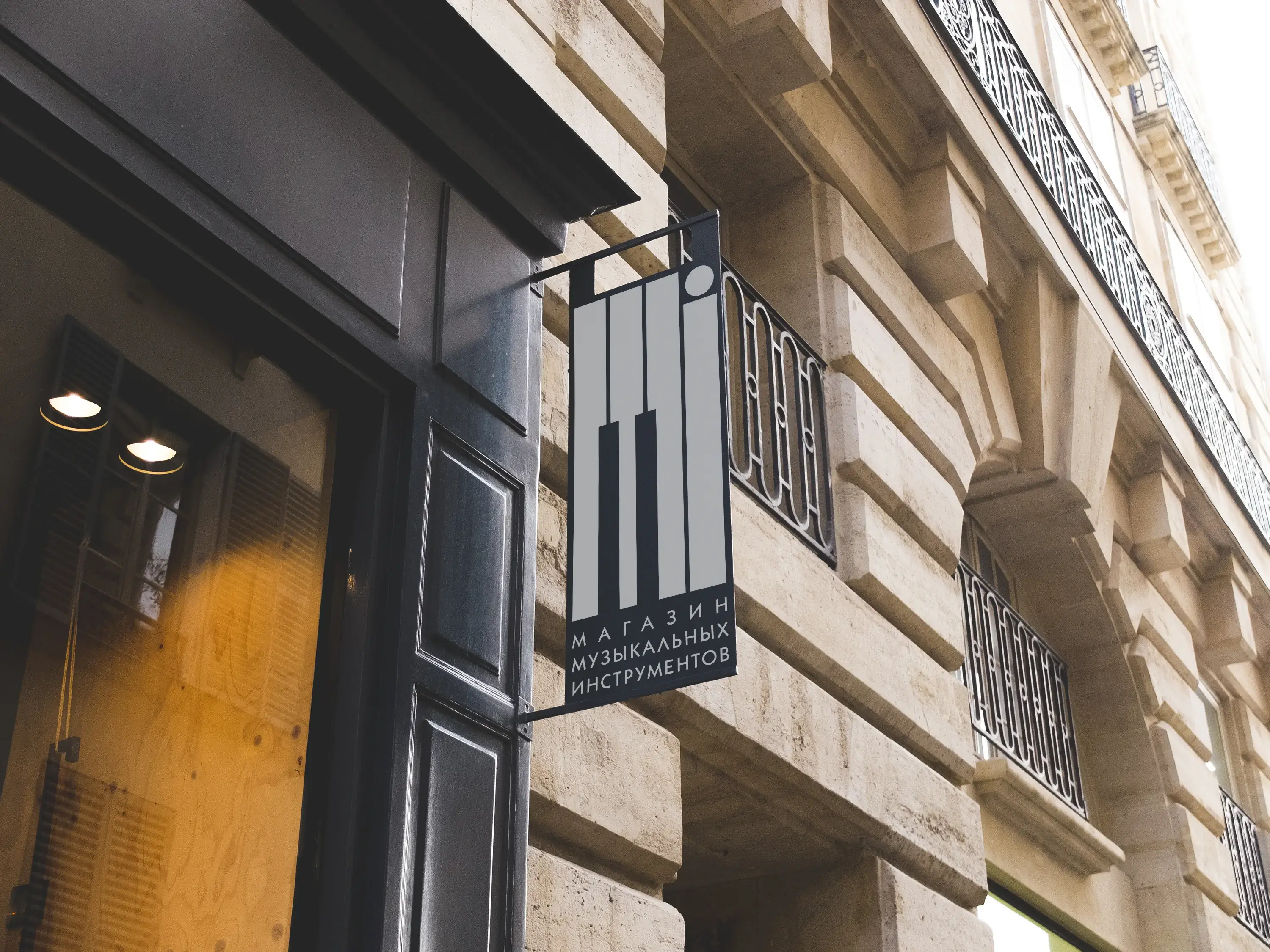
The project included the naming ("Mi", from "Mira gestorum"), a logo available in Russian and English, business cards and signage. The logo works equally well across different scales and applications, from printed materials to outdoor signage, reinforcing the store's image as a professional, sophisticated and musically inspired establishment.


