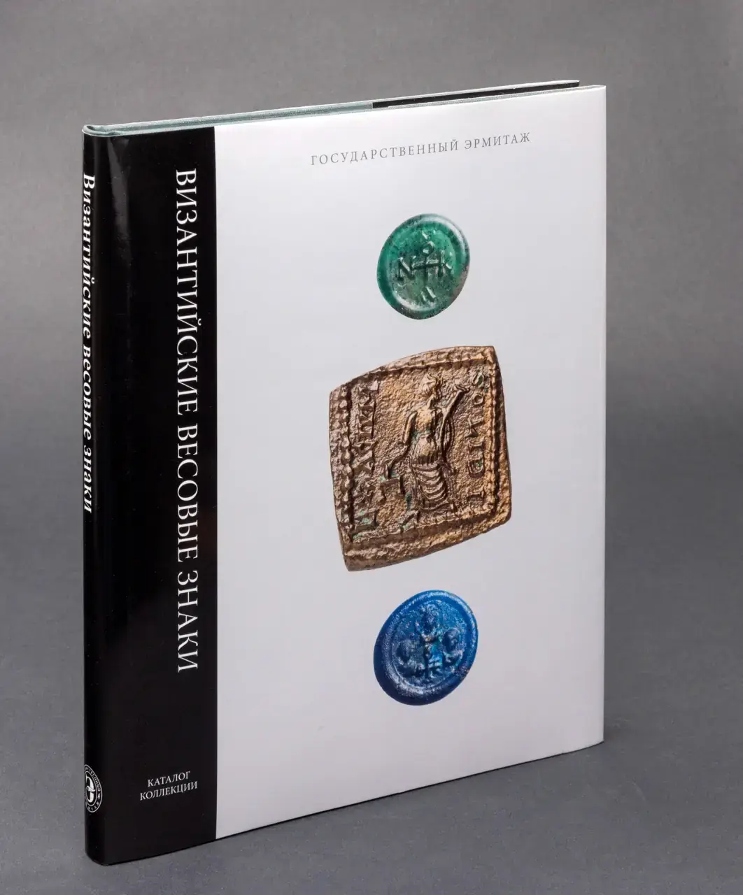
Hermitage State Museum, Catalogue of the Collection
Book Series Dust Cover Design
Concept & Design Thinking
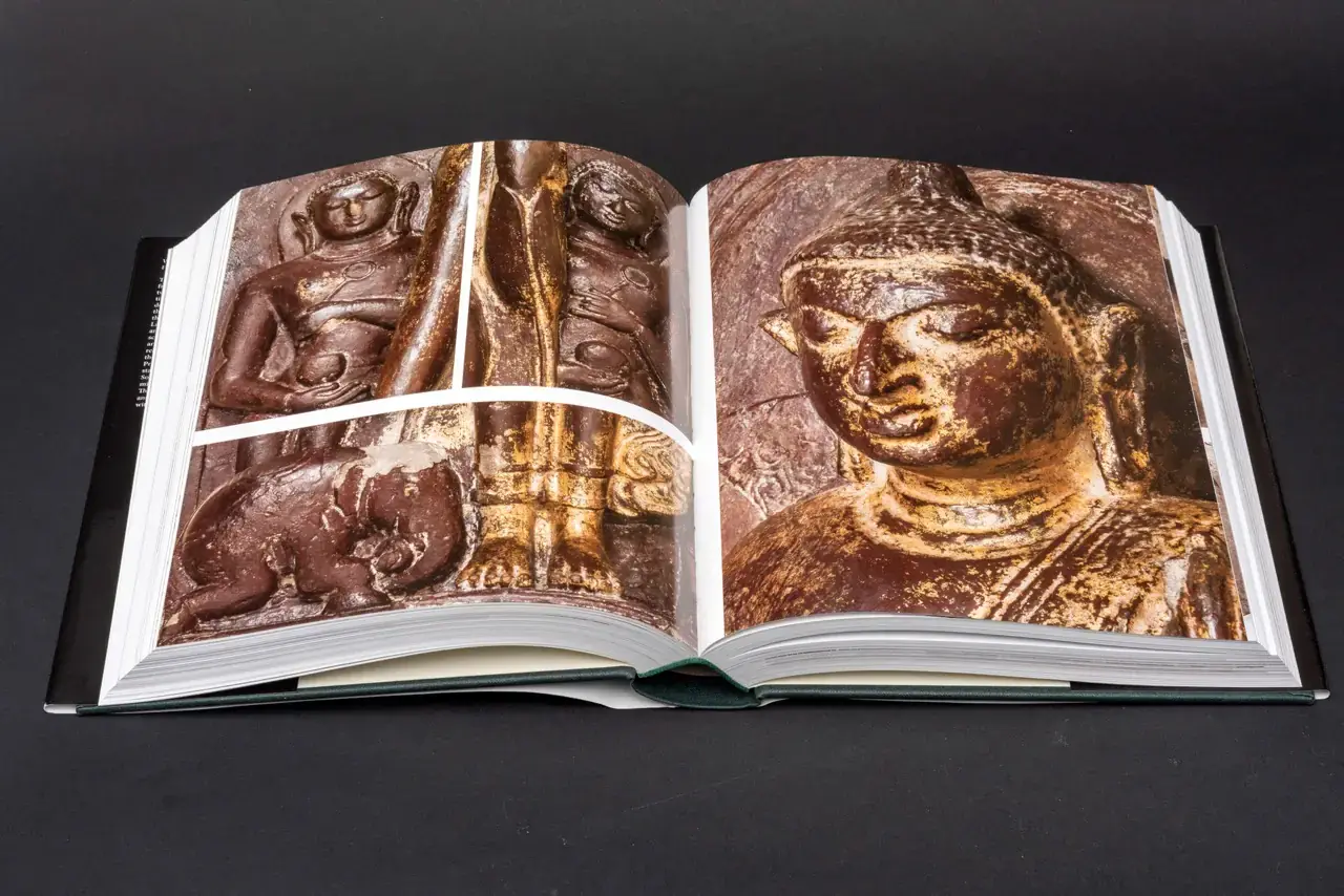
The project was initiated when booksellers requested the Hermitage to modernize the appearance of its prestigious, academically-focused collection catalogues. Historically, these publications have maintained a classic, deliberately austere aesthetic — green fabrikoid binding with gold embossing — reflecting their scholarly importance and the museum's institutional authority.
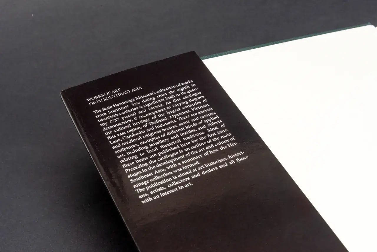
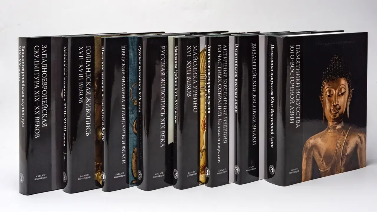
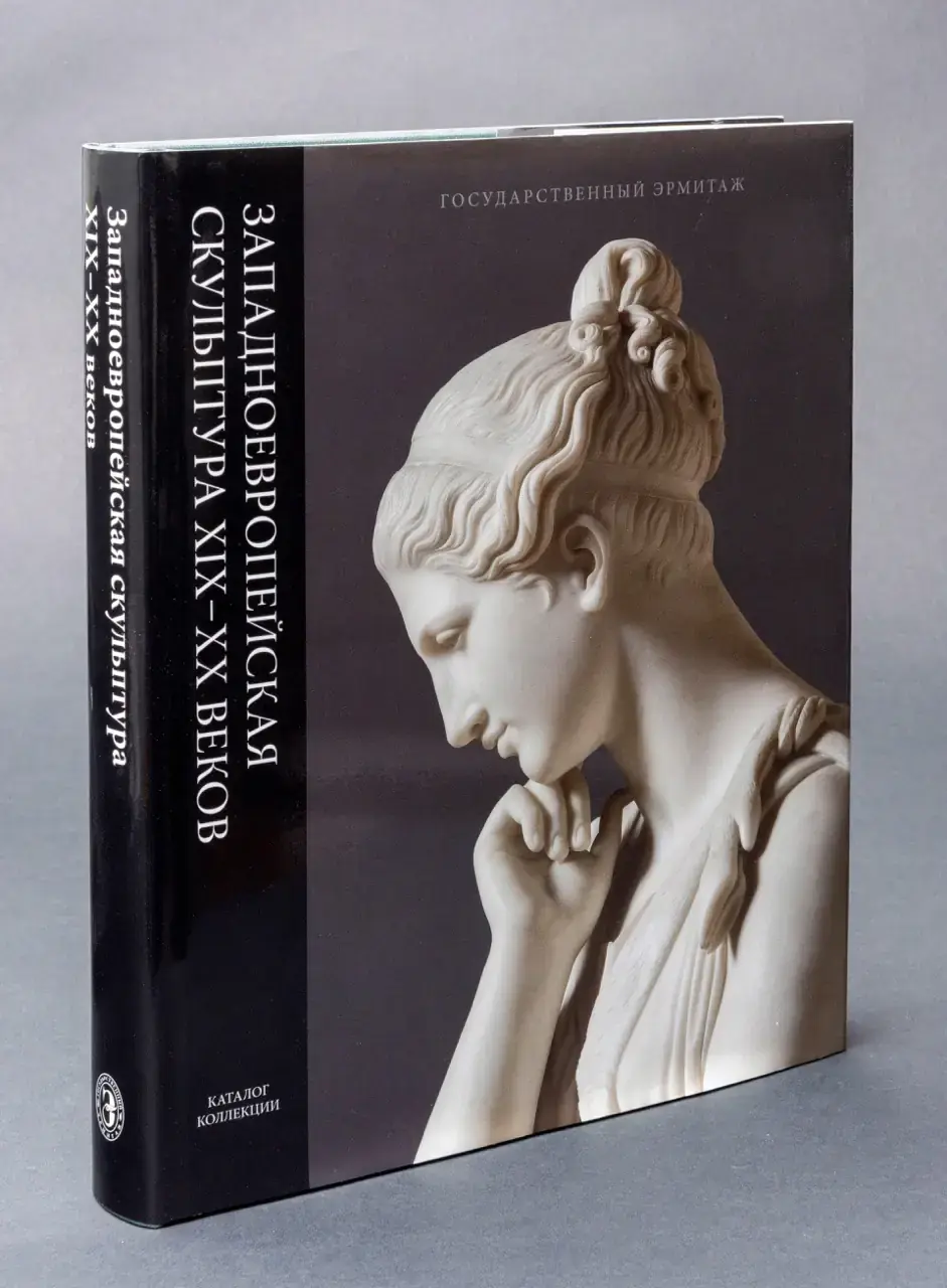
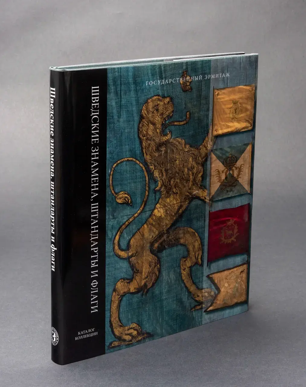
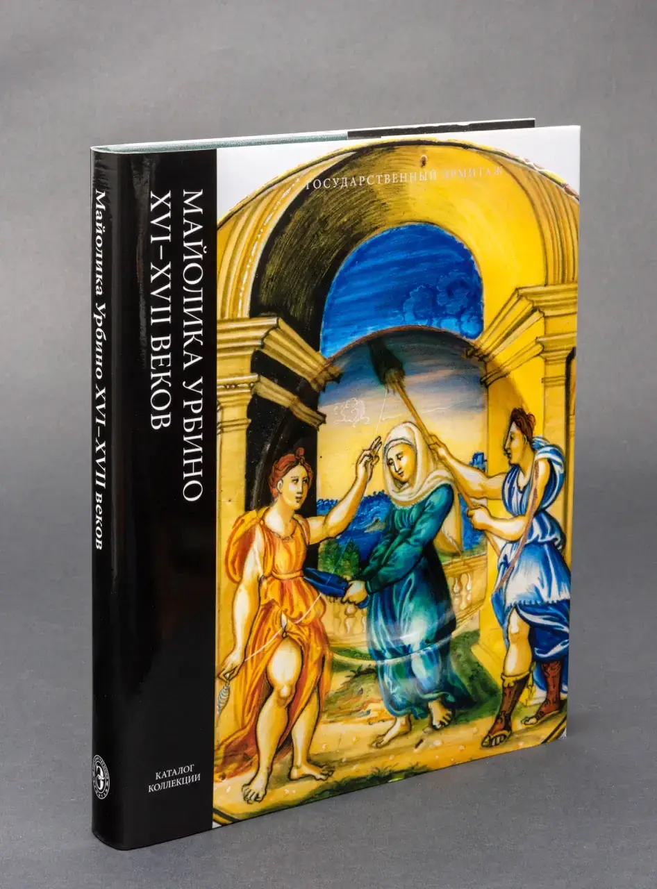
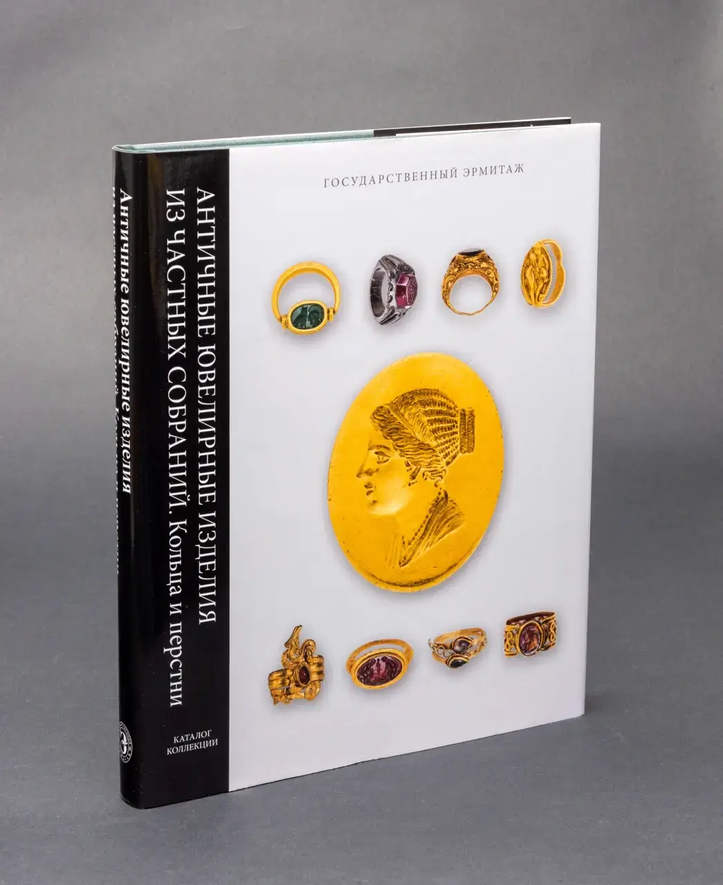
The design solution was to introduce an elegant yet contemporary dust jacket that would allow the catalogue to retain its authoritative character while providing an inviting and visually appealing appearance. The new covers have been thoughtfully conceived as visual previews of the treasures inside, presenting carefully selected fragments of key artworks from each collection. Each cover prominently features a striking close-up that instantly captures attention and signals the scholarly richness and cultural value of the content inside.
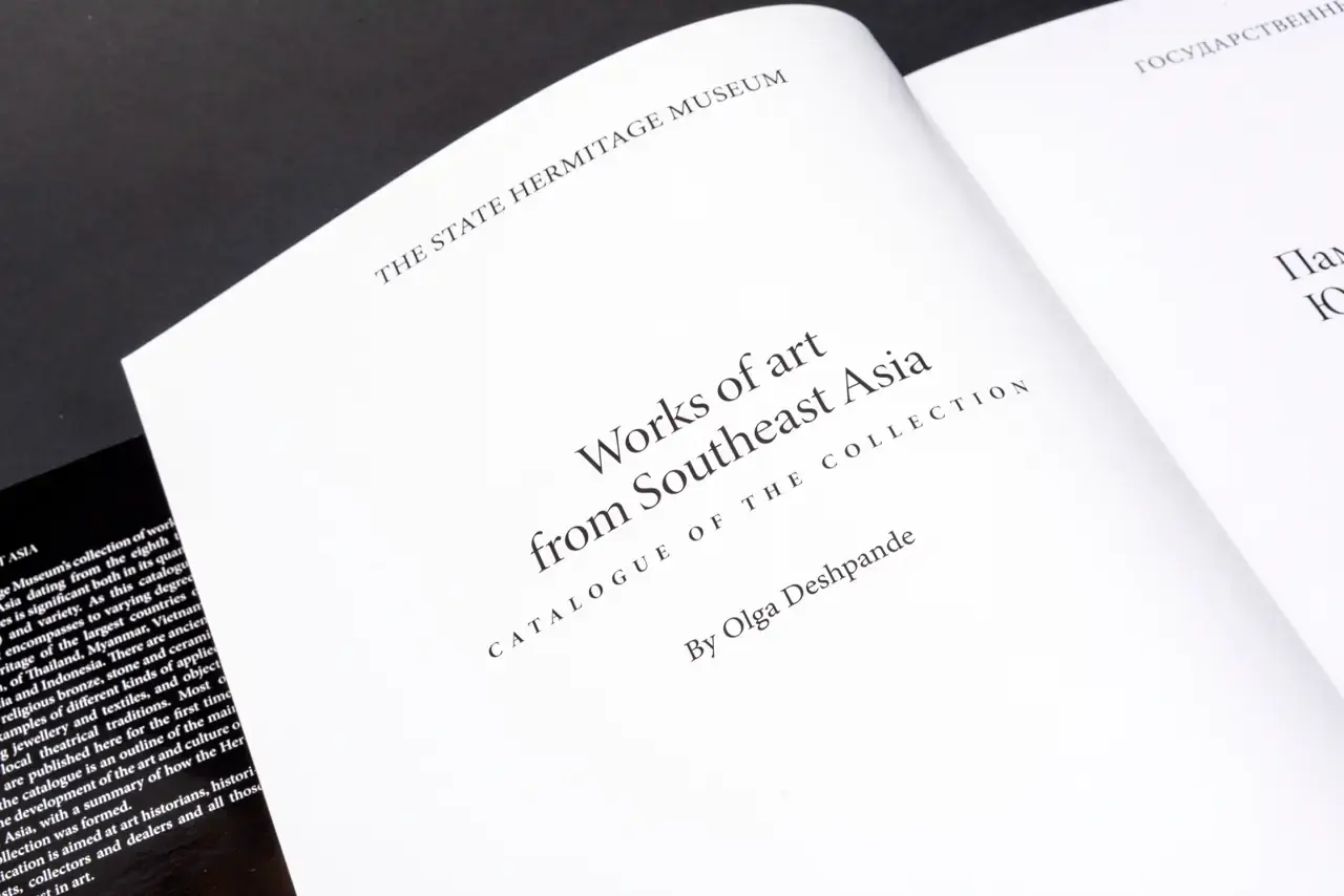
To harmonise modern and classic aesthetics, I used a sleek typographic layout and high-quality photography set against a solid black or deep neutral background, evoking the timeless ambience of a museum. The vertical black stripe with clean white typography along the spine ensures easy identification, coherence and visual rhythm throughout the catalogue series.
This subtle yet powerful visual language successfully balances the academic rigour of the museum's heritage with contemporary graphic elegance. The result is both appealing to a wider audience and respectful of the Hermitage's scholarly traditions, significantly increasing the catalogue's shelf appeal without compromising its academic prestige.
